Though he died at age 40 in 1926 J. Neel Reid remains Atlanta's most esteemed architect. It's a bit unfair as design is collaborative, yet they don't call them Hentz, Reid & Adler's houses, they call them Neel Reid's.
As architect Greg Walker elegantly put it to me just last week: "Neel Reid was a stud."
I follow estate sales so I can tour Neel Reid designed houses..I have to see them.
The last one I saw was 2922 Andrews. I'll show you a few pictures of it.
Though he designed in several "classical" styles most are like this. My mom and dad would have called the style "Colonial" or "Early American." My youthful impression is they'd look fine in Williamsburg or Charleston. Folks have liked this style for a few centuries, still do, they still build them this way.

Stuart Witham House (1926) the year of Neel Reid's death. 7,370 square feet on 1.9 acres, 6 BR 5 1/2 BA in Peachtree Heights West.

Let's see:
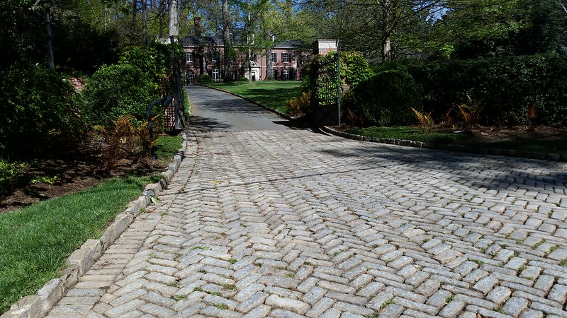
Apron, lots of Neel Reid driveway have rough brick aprons.
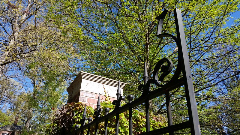
Gate post and gate. Lot's of detail though it seems simple.
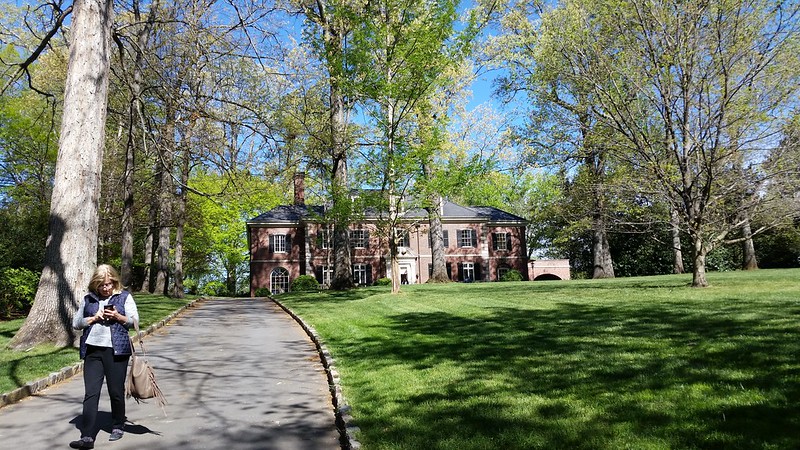
These lots were laid out by Carerre and Hastings to yield perfectly sited homes. The driveway curves in front of the house then to the porte-cochère on the right.
This is big, it's way up there but speaking to me: "Terry, come on up."
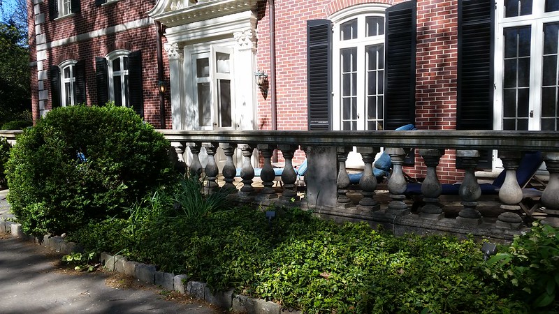
There's this chunky balustrade surrounding the front porch. When you are on the porch you fell safe in its embrace. That's the way I feel anyway. How about those nice double windows with transoms and arches and arched shutters. They are right on the money. More on these in a second.
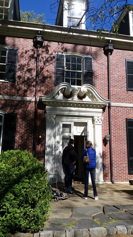
It's human sized. No steps. From here it's not a mansion on a hill. It says come on in. This looks easy but everything is sized, proportioned, and detailed so you don't really notice.
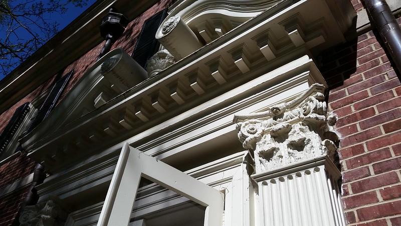
Heroic swans neck pediment and door millwork. HEROIC and looks great from close or a distance. This is where guests arrive and feel really important.
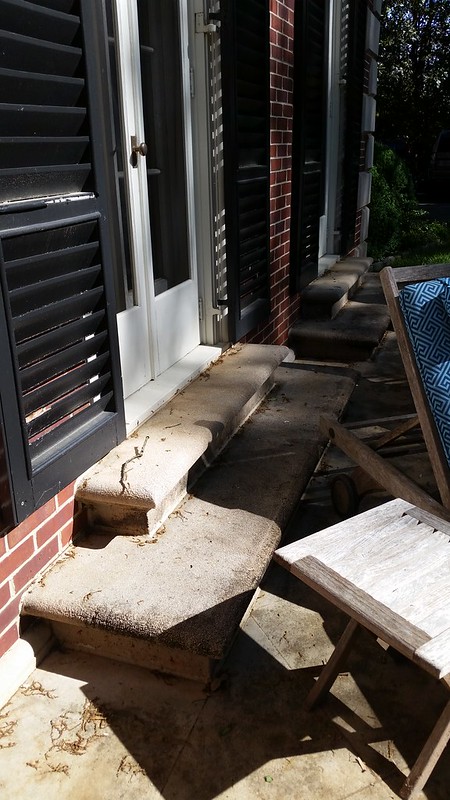
Those great looking windows onto the porch are actually big. They are walkout (and in) French doors with steps to the porch, perfect for party circulation. From the street they just look like the correctly sized windows.
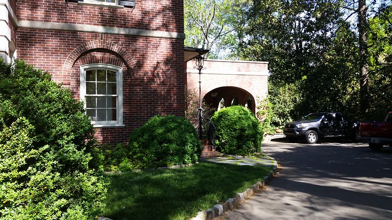
The driveway curves around the front to the porte-cochère. This is the informal side of the house, the family entrance, the everyday side, the kitchen side where you unload the groceries.

This is the gorgeous family entrance. The bay window is in the family dining room. The kitchen to the right. Beyond the door is the family stair up the the private rooms. Looks like a fine townhouse from here. 8 over 8 over 8 triple hung windows look just right, flared metal roof, 4 over 4's upstairs with segmented arches and proper shutters. Right on the money, not cheap to design or build but oh so beautiful and harmonious.
Heading in.
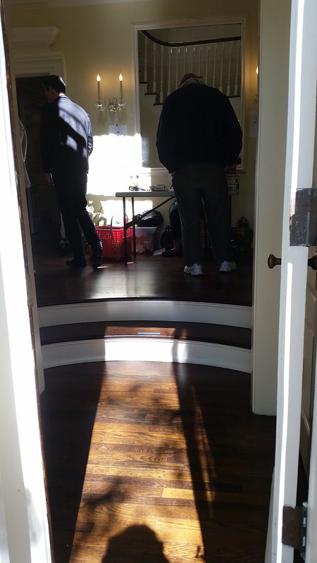
Expecting to enter a colossal space we actually enter a tiny and cozy vestibule with coat closets on either side. There's a stop up into the foyer, also the formal stair hall. From here you circulate to the formal rooms ahead and to the left, the family rooms and stair toward the right.
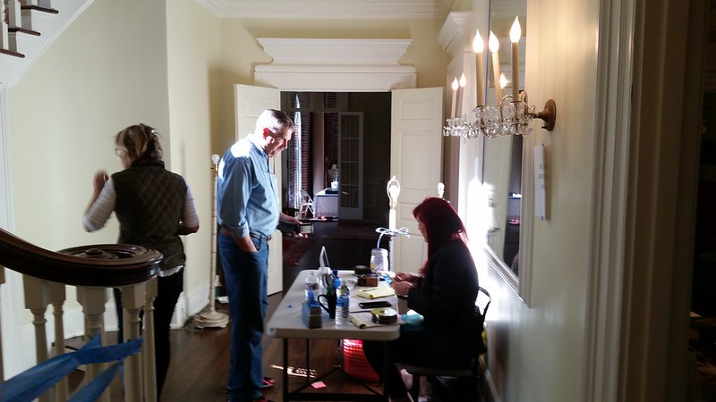
That's it, the foyer. Ahead to the formal living room, dining room to the right, behind are the powder room and informal spaces.
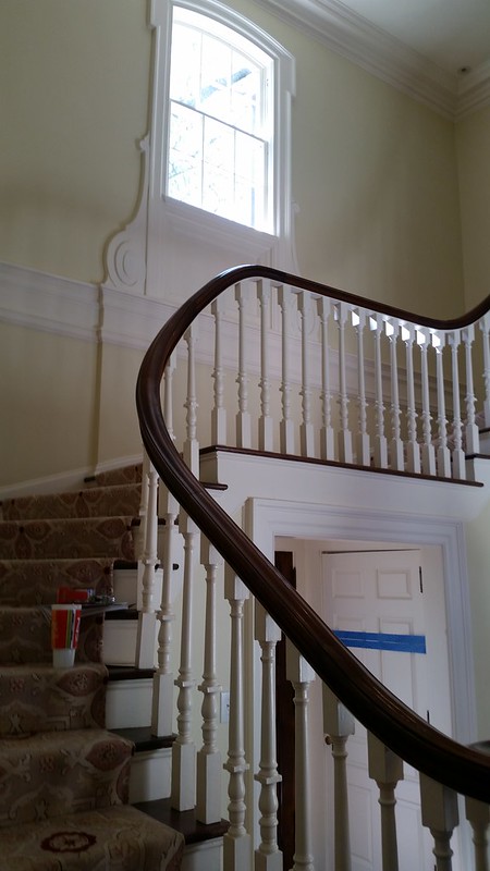
The formal stair curves over the vestibule.
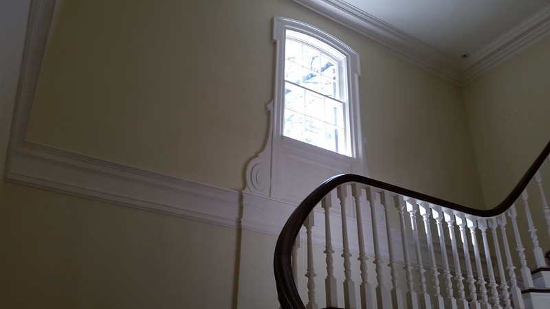
Lit by the widow with "knees" that buttress the bottom.
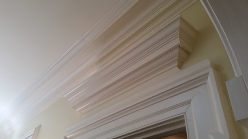
Heroic millwork in the formal rooms. Every detail here designed to be just right for the space considering the owner budget.
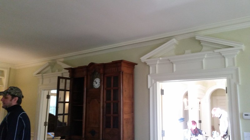
In the formal living room, pedimented doors, the right leading the the foyer, the left to the dining room. My camera couldn't take it in.
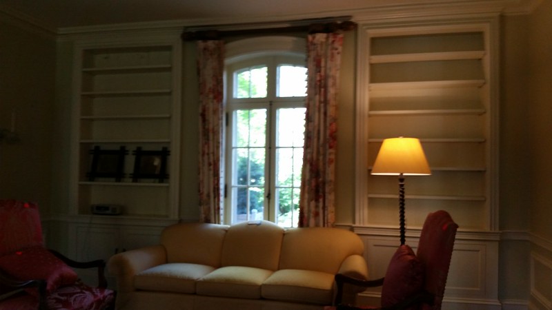
It wasn't actually dark. That "window" is a French door to the back patio.
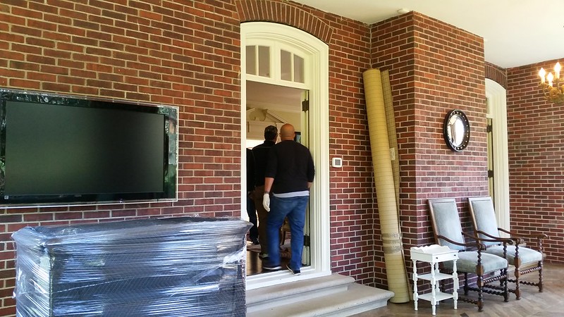
The living room opened to the sun room. This door goes to the living room.
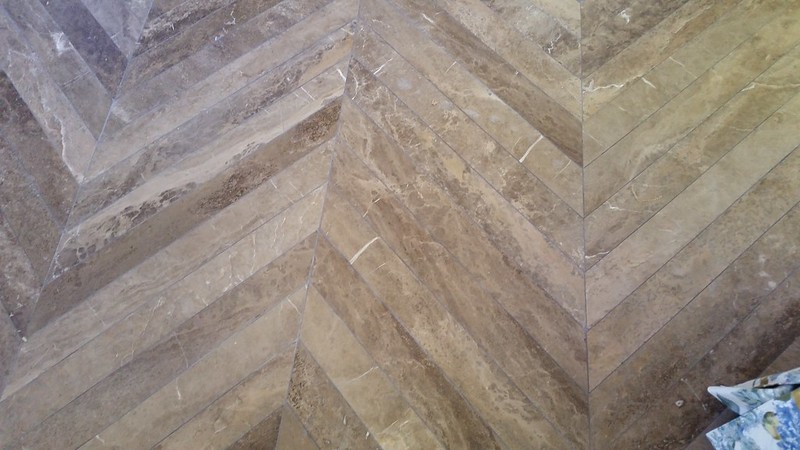
Herringbone marble sunroom floors are nice a break from your neighbor's black and white marble tiles.
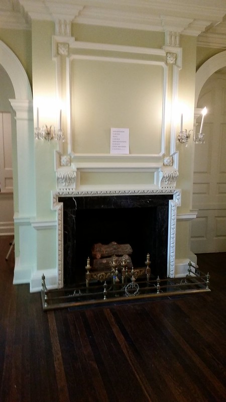
The formal dining room is circulation central so balanced between doors and windows it didn't feel the least bit stuffy. Deep, deep arched doorways frame the fireplace.
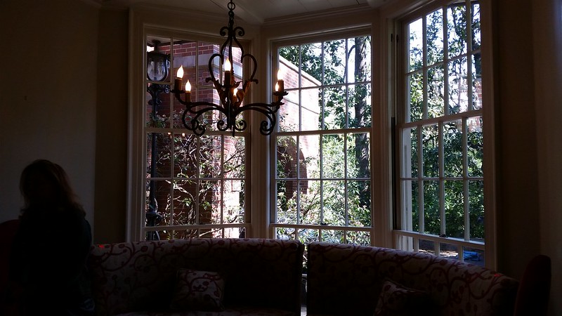
Here's the family dining room, a big banquette curved under the bay window. You have room for a bit extended family in there or feel cozy with you and a friend. Kitchen to the left, family entrance and family stair to the right.
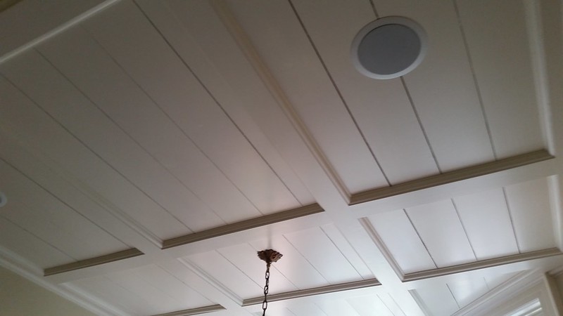
The family dining room ceiling is paneled and bead-boarded just right I think.
The kitchen was just fine but modernized and functional. An informal, family space.
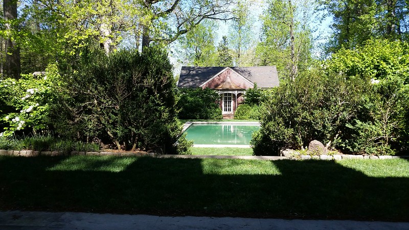
The axis from the dining room.
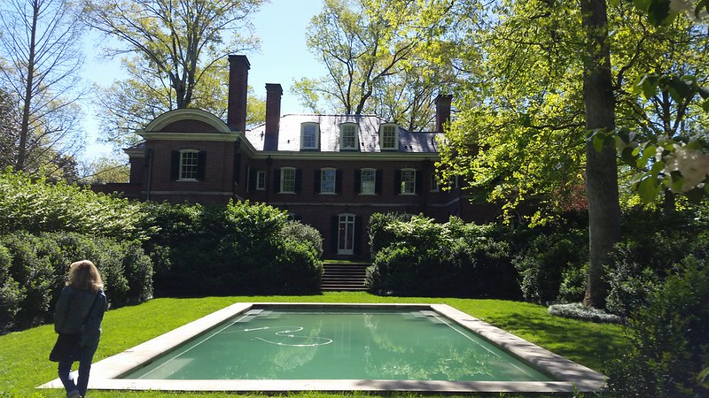
The house is a bit more imposing from the back but check out that curved pediment on the wing.
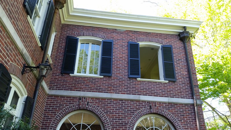
The detailing on the back was all there. I'm in the "horseshoe" on the back patio. Sunroom windows below bedroom above casement windows open all the way but are innies rather than outies thus safer to wash.
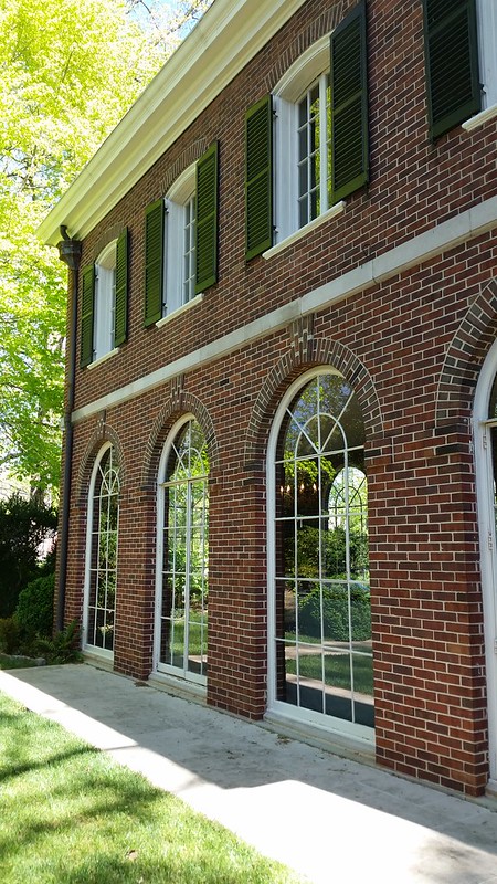
The sunroom opened to the side garden.

Took a lot of design and craftsmanship to make the little garden subtle.
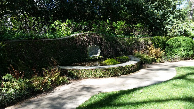
I'm a scallop shell enthusiast how about you?
I think this is my 6th Neel Reid, all seen at estate sales.
If you show me yours, I'd be happy to show you mine when I get one.
Thanks so much.
"For several generations Neel Reid was the best-known residential architect in Atlanta. His houses enjoyed a pedigree, level of prestige, and quality that made them the most sought after in the city. Owning a Neel Reid house, with its refinement of style, was thought to be a mark of taste and social acceptability. That Reid's firm, Hentz and Reid, should provide a training ground for Philip Trammell Shutze, the leading architect of what architectural historian and author William R. Mitchell Jr. has called the Georgia School of Classicism, is evidence that it was one of the most important Atlanta firms of the 1910s."
Craig, Robert M. "Neel Reid (1885-1926)." New Georgia Encyclopedia. 11 December 2014. Web. 12 April 2017.


