It was a high bar. It's a across the street from an Ivey And Crook, a block from two more "Crooks" and a long block to Philip Shutze's Dwoskin House.
It's a difficult elevated corner, book-end'ed with a fine diagonally sited Italianate on the other corner. It's a small lot so there's no hiding and you can see all four sides from the street.
And of course it has to meet the lenders' size/amenity checklists for the neighborhood demographic.
This wasn't easy.

The old house was built 1948, 2,572 square feet, an infill I think, most neighboring houses are pre-Depression.
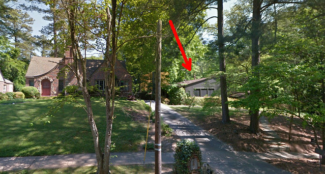
It was low slung up in the ivy and shade. You'd notice the lot rather than the house.
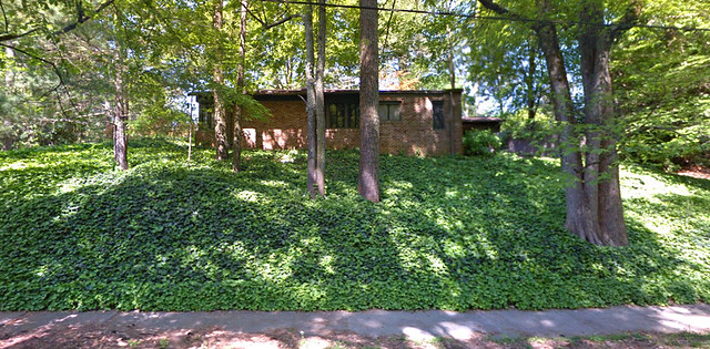
From the street.
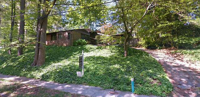
The back showed some details.
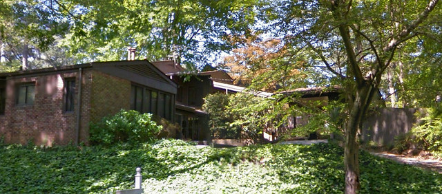
It tumbled down the hill. This is how the architect solved the problem.
It eventually disappeared into the setting. Some folks like them like that.
But it's hard to build the 4,500+ square feet the market requires and disappear into the landscape.
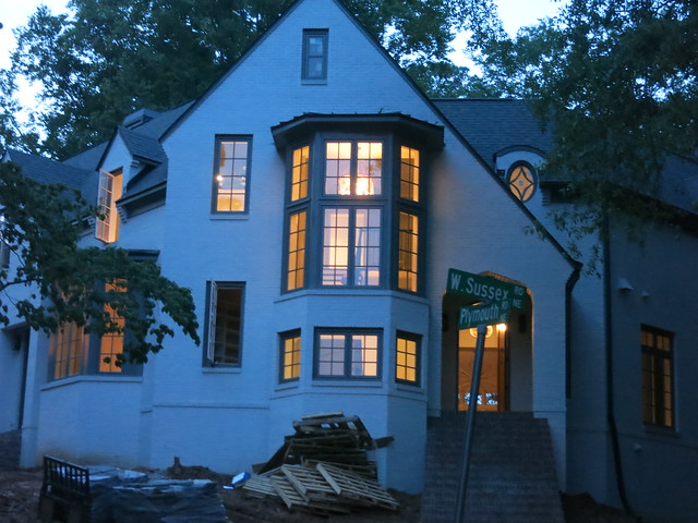
Instead of hiding it they built a landmark in stylistic harmony with it's neighbors.
Some folks say it's too big. But at 4,289 square feet it's smaller than neighboring tear-downs on smaller lots which often exceed 6000 square feet on 1/5 acre.
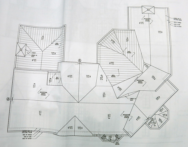
This doesn't look easy to me.
But diagonals are cool and the "L" shaped front and "U" shaped back presented opportunities for "Pattern 107 - Wings of Light."
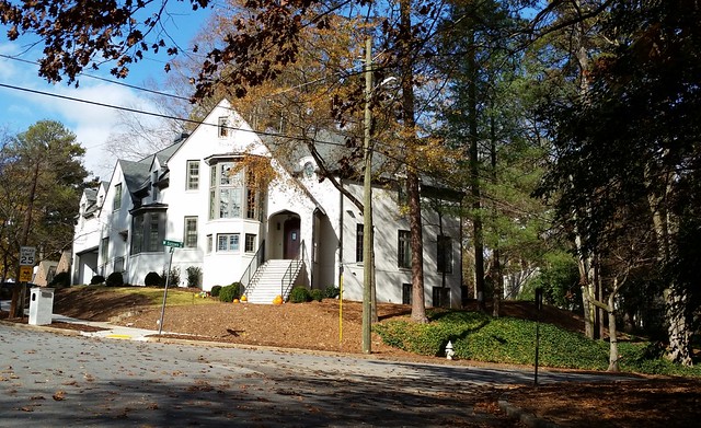
It's a landmark and I like it.

No comments:
Post a Comment