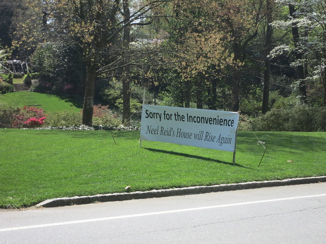
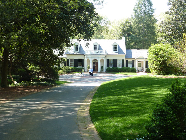
Though I'd driven by 100's of time and seen pictures, I can't for the life me remember what I THOUGHT it would look like. I went on media day. Thank you. Thank you. Thank you.
The 2014 Decorators' Show House & Gardens benefiting the Atlanta Symphony Orchestra is in full-contact show house gonzo done up by dozens of Atlanta's finest designers. You should go, it's open through May 18.
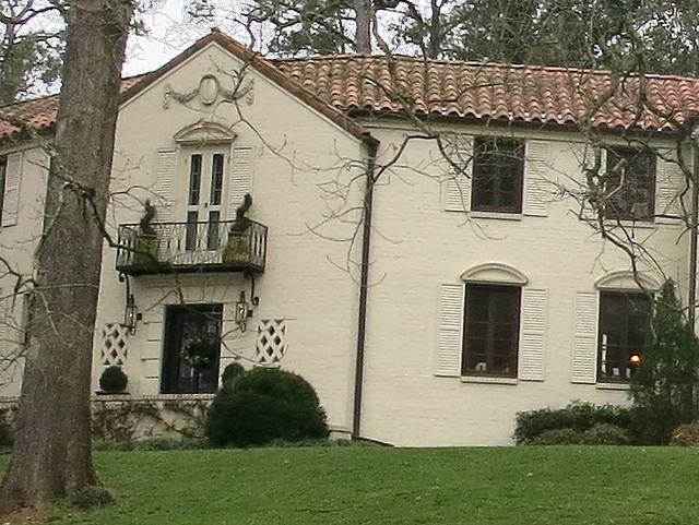
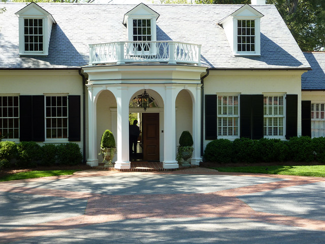
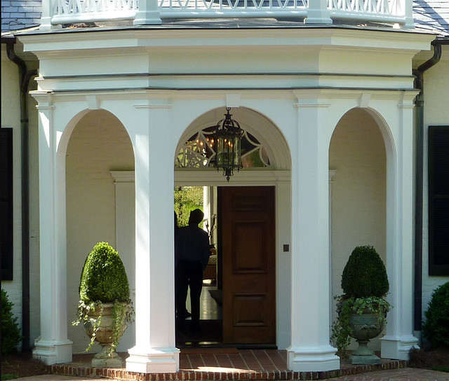
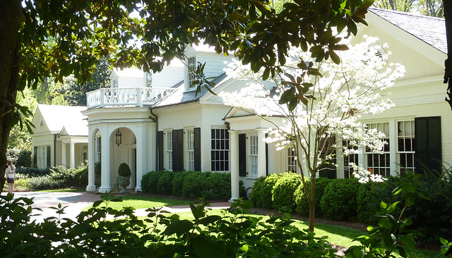
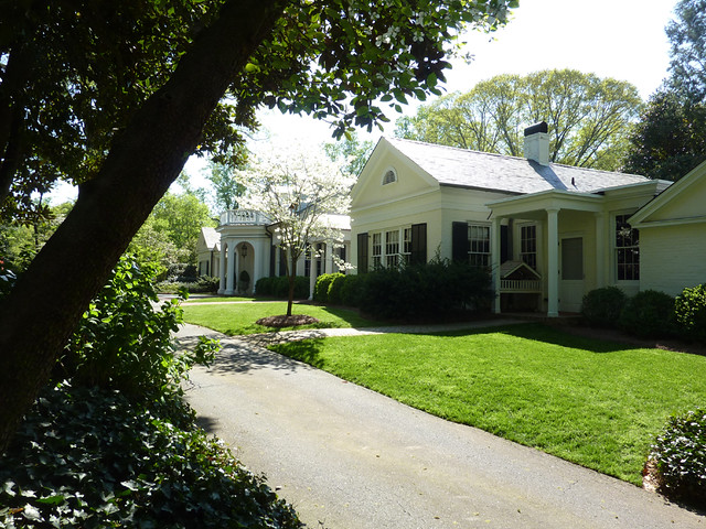
"Shutze and Reid probably collaborated in designing the Rhodes House...completed just before Reid died...Shutze designed the entry facade..." American Classicist: The Architecture of Philip Trammell Shutze by Elizabeth Meredith Dowling
It has a terrific master suite. You can go about your business in bath and closet without disturbing your sleeping loved one. It's big but doesn't make me feel small.
The five second floor windows on the front light the master suite. The left two serve the bathroom (gentleman's window on the left, lady's window second from left) , the center window serves the ladies closet, the right two flank the bed. These windows face south towards Paces Ferry, there are east, west, and north facing windows too.
The front of the house is to the left.The man's sink and privy are around the tub to the right, the lady's sink and privy are around the tub to the left. The window behind the tub faces west and isn't on front of the of the house.
The video starts in the second floor hall atop the grand stair. I turn south to enter the half moon shaped vestibule.
Bravo.
136. COUPLE'S REALM:
"The couple's realm needs to be the kind of place that one might sit in and talk privately, perhaps with its own entrance to the outdoors, to a balcony. It is a sitting room, a place for privacy, a place for projects; the bed is part of it, but tucked away into an alcove with its own window; a fireplace is wonderful; and it needs some kind of a double door, an ante-room, to protect its privacy." A Pattern Language: Towns, Buildings, Construction by Christopher Alexander , Sara Ishikawa , Murray Silverstein , Max Jacobson , Ingrid Fiksdahl-King, Shlomo Angel
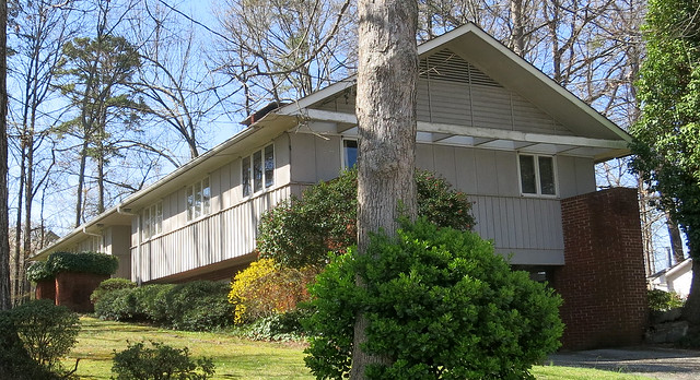
P.S. The "Pink Palace" isn't pink anymore. I wish it was.
Pages
▼
Monday, April 28, 2014
Sunday, April 20, 2014
GTLork at the Goat Farm thanks to JT and the Varsity
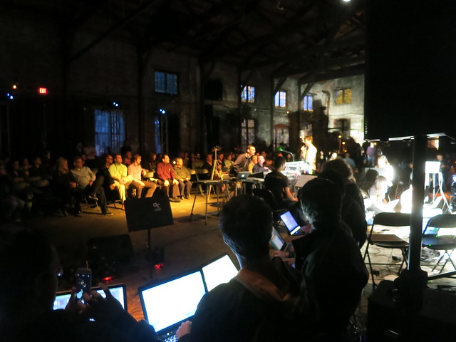
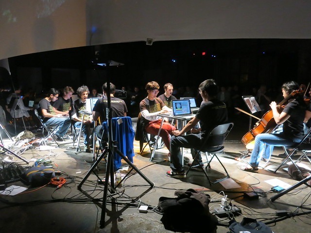
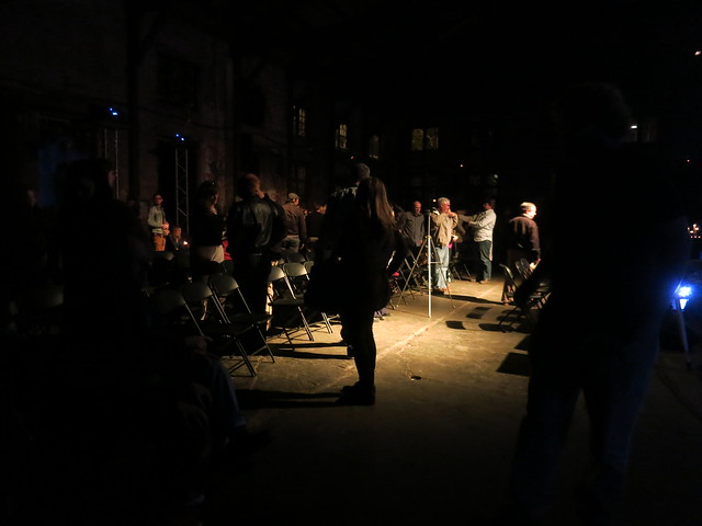
A great event in a great space and I almost didn't go. As we approached, ambient music wafted from Goodson Yard. From the door we could see the long line of laptopers beneath giant screens.
It was free, it was odd, it was at the Goat Farm, a performance of student works by the Georgia Tech Laptop Orchestra (GTLork) & New Music Ensemble.
On Thursday I was eating at the Varsity next to a man and his teenage sons. Turns out it's music photographer Jim 'JT' Gilbert from upper New York state visiting Georgia Tech where his 18 year old has been accepted. They'd been told to eat the at the "V" while they were in Atlanta - good choice.
Y'all know me: We chatted it up and bonded over french fries. They'd spent a long day at Tech and were heading back to the hotel before driving home to New York on Friday.
So I asked if they wanted to go to the Goat Farm to hear the Georgia Tech Laptop Orchestra. They said yeah and we headed out.
My wife said, "They actually went with YOU? Didn't they know how strange you are?"
They didn't exactly go with me, they followed in their car. What were they thinking as we turned into the dark Goat Farm drive and parked in the grass?
It was odd and wonderful, thirty+ musicians and a few hundred fans in Goodson Yard.
It was dark, there were three giant screens, there were a few traditional instruments. I had no idea what would happen next.
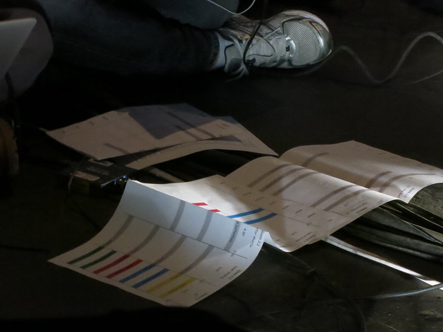
A score.
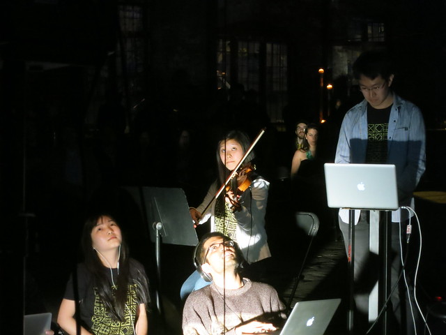
Title: “Fusiform” Members: Chris Howe, Raja Raman, Ziwen Fan, Xinquan Zhou Description: A performance controlled by facial expressions, wherein laptop performers affect the acoustic musicians signal with various effects via web cam control.
This trio played over ambient music and it was wonderful.
Title: “Impossible Mission” Members: JUAN MARTINEZ-NIETO, Shuo Liu, IMANKALYAN MUKHERJEE, Cian O’Brien Description: A piece written for Trumpet, Tenor Saxophone, Euphonium, 3 laptop musicians and 3 puzzle solvers. The music tells a story of solving a jig-saw puzzle that eventually unfolds the score for the musicians to play.
Weird and wonderful and I almost didn't go. Thanks to JT and sons.
I don't know if the Georgia Tech Center for Music Technology has a mailing list, so we'll need to check their event calendar.
Thursday, April 17, 2014
Do Two Sinks Tell a Tale? -1951 Rancher Teardown
With sale stuff strewn everywhere - all those personal mundane things -
in rooms mostly unchanged for 40 years it was like looking into the
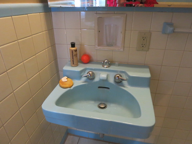
coffin of a stranger. But these "D" shaped sinks with porcelain spouts were clean and looked
almost new. It was easy to imagine loved ones brushing their teeth there
thousands of time.
It's a teardown, a 1951 rancher on Wildwood about 2,300 square feet over a full basement. The last owners bought it in 1977 and I'd guess they lived there until the end. I went to the estate sale to look at the house. Architecture tourists do this sort of thing when we can.
It's a very livable house but they don't build them like this now. And you don't update ranchers in this neighborhood. You build 6,000 square-footers.
The master sink in taupe.
The other sink in blue.
The house has been demolished, summer of 2014.
Sunday, April 13, 2014
Two New Corner Houses from Harrison both Blend and Show Off
Architecture tourists have the sweetest dreams about corner houses. Even the little ones are important.
I've followed these two corner teardowns for a while. I cheered when the Harrison Design Associates signs went up. Harrison is particularly clever in adapting elements from neighboring houses. It's one of their trademarks and very important for small lot neighborhoods. It doesn't matter so much on "estate" lots where you can only see one house at a time
This one is on a little hill in Lenox Park a block from Shutze's Dwoskin house and across the street from two Ivey and Crook houses. That is a high bar.
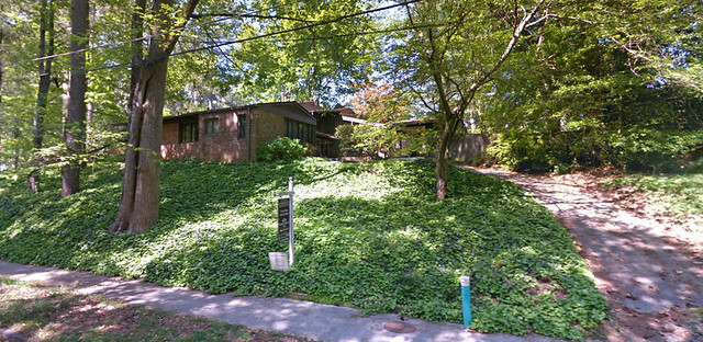
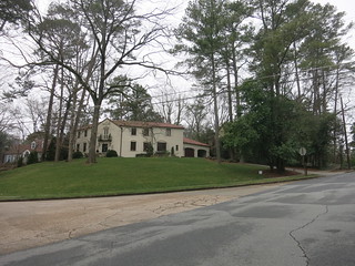
The teardown was a low-slung mid-centry modern camouflaged in ivy. It ignored the street. It was more a green space than a house lot.
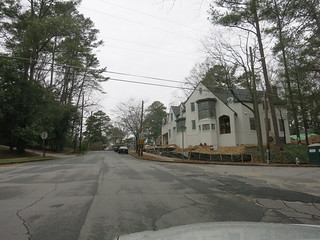
Here's the new house emerging from the clay with a coat of primer. The front door points diagonally into the corner. I call this "honoring the corner" because it contributes to the feeling on the street. They divided the lot so they'll build another house to right some day.
It's bit smaller than nearby teardowns. You can't tell that it's a skinny "L" shape, a house of wings that will bring in the light. Pattern Language fans will remember "107. Wings of Light"
The other corner is the most prominent setting on the street. It takes a lot of detailing to manage this much restraint. Who doesn't love a shield with swags?
They aren't matching bookends but they go together in shape, style, mass and the aim of the front door. Someone suggested the left house is a Shutze. I don't know if there is any evidence but I wouldn't be surprised if that proved true.
26 second video:
Now the other house:
The other is in Brookhaven. It's not in the country club proper but within the halo. You build 5,000+ square feet if you are doing a teardowns around here. This was picturesque, doomed, and I loved it, see "The only one I care about will soon be a goner."
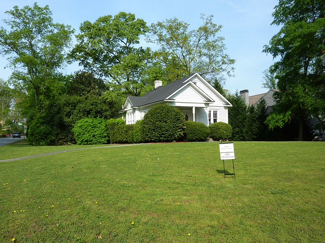
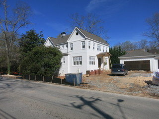
The old house looked like farmhouse; the new one will too but grander. It looks like it has evolved over the generations with outbuildings. It's smaller and more restrained than nearby teardowns.
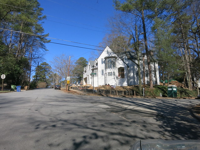
Here's the other corner on a little rise, a high quality design I think. The new Georgian "farmhouse" will be a good neighbor on what will be a memorable corner. Other than the pretty gabble facing the side street the modern ignores the corner, ignores the street.
Not bookends but related, horizontals galore broken up by vertices in the widows, and board and batten siding (in the gables of the teardown). Fancy gables are a bit rare in a mid-century but here they are. The deep overhang in the modern echoes in the teardown. Overhanging roofs are NOT a Harrison Trademark. The embracing crook between garage and house honors the corner.
18 second video:
I'll show you when they are finished and landscaped.
I've followed these two corner teardowns for a while. I cheered when the Harrison Design Associates signs went up. Harrison is particularly clever in adapting elements from neighboring houses. It's one of their trademarks and very important for small lot neighborhoods. It doesn't matter so much on "estate" lots where you can only see one house at a time
This one is on a little hill in Lenox Park a block from Shutze's Dwoskin house and across the street from two Ivey and Crook houses. That is a high bar.
The teardown was a low-slung mid-centry modern camouflaged in ivy. It ignored the street. It was more a green space than a house lot.
Here's the new house emerging from the clay with a coat of primer. The front door points diagonally into the corner. I call this "honoring the corner" because it contributes to the feeling on the street. They divided the lot so they'll build another house to right some day.
It's bit smaller than nearby teardowns. You can't tell that it's a skinny "L" shape, a house of wings that will bring in the light. Pattern Language fans will remember "107. Wings of Light"
The other corner is the most prominent setting on the street. It takes a lot of detailing to manage this much restraint. Who doesn't love a shield with swags?
26 second video:
Now the other house:
The other is in Brookhaven. It's not in the country club proper but within the halo. You build 5,000+ square feet if you are doing a teardowns around here. This was picturesque, doomed, and I loved it, see "The only one I care about will soon be a goner."
The old house looked like farmhouse; the new one will too but grander. It looks like it has evolved over the generations with outbuildings. It's smaller and more restrained than nearby teardowns.
Here's the other corner on a little rise, a high quality design I think. The new Georgian "farmhouse" will be a good neighbor on what will be a memorable corner. Other than the pretty gabble facing the side street the modern ignores the corner, ignores the street.
18 second video:
I'll show you when they are finished and landscaped.
Wednesday, April 9, 2014
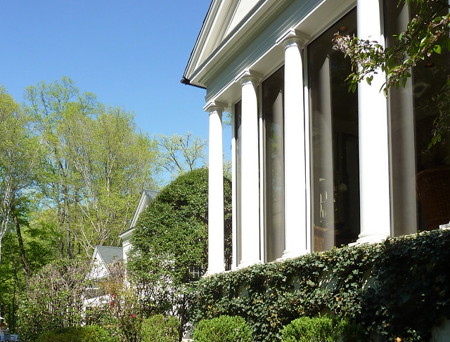
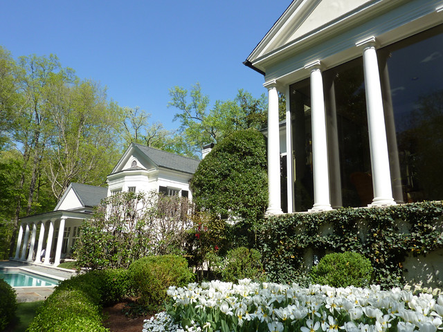
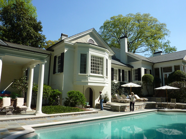
UPDATE: Cam Dorsey House by Hentz, Reid & Adler 1923-24 Destroyed by Fire April 1, 2014
UPDATE April 9, 2014
That's the spirit!
Original post:
Folks said I'd fall in love and I did. I never expected to see it again but I had hopes. It was 7,000+ square feet perfectly sited on 5 acres, a landmark in Atlanta's most prestigious neighborhood. From Habersham it seemed a perfectly framed hilltop folly in the form of a Greek temple. Yet this giant house wasn't intimidating. It was a family home scaled for humans.
Thank goodness I took a few exterior pictures. Here's what it looks like today "Huge Buckhead home goes up in flames" - Atlanta Journal Constitution.
Rodolfo Castro invited me to Buckhead in Bloom, a fundraiser for the Atlanta Preservation Center. That was April 11, 2010, four years before the Cam Dorsey Residence burned down.
We lost two great houses in two weeks: the Aronstam House burned on March 18 and now this.
]
It's a Neel Reid Design, Hentz, Reid & Adler Job 527 1923-24 (See J.Neel Reid Architect: Of Hentz, Reid & Adler & the Georgia School of Classicists by William R. Mitchell Jr.). Photo is from 1929, image purchased from the Atlanta History Center.
A winged Cape Cod with porticoes everywhere.
This is the Vernon side, the back side, the main entry that you can't see from the street.
Photo is from 1929, image purchased from the Atlanta History Center. See below for the precedent of the polygonal porch.
Neel Reid got it right the first time and gave it a motif for integrating additions.
You could see all the way through to the Hambersham side, through the picturesque portico visible from Habersham.
It's a low rambling complex with sheltering porches and no steps.
Four porches in a row.
This is the view from Habersham. 1929 image purchased from the Atlanta History Center.
The portico you could see from Habersham was a glassed-in sun room.
It was all shutters, gables and porticoes. 1929 image purchased from the Atlanta History Center.
The additions kept the spirit.
From the street you'd never know.
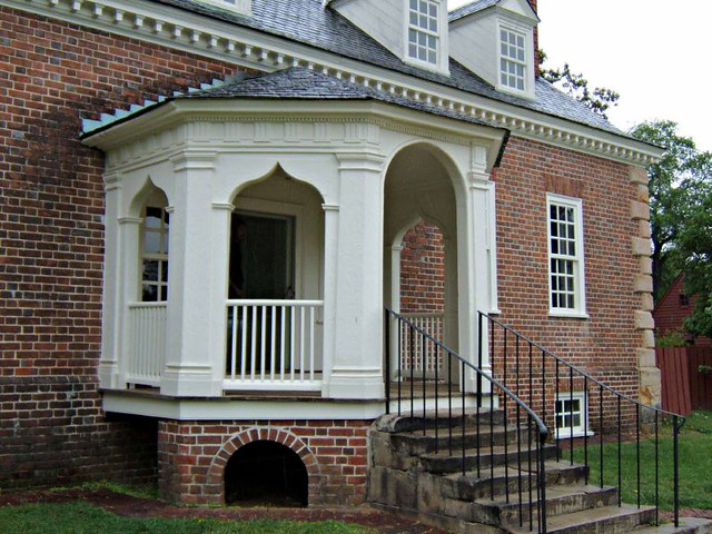
What about the polygonal porch?
Photo by Rictor Norton & David Allen from Flickr.
Polygonal entrance from George Mason "Gunston Hall" River front entrance. Thanks to Robert Craig for telling me about it.
"As Buckland used polygons on the river porch at Gunston Hall and later on the two wings of the Hammond-Harwood House in Annapolis, he seemed to espouse a form then achieving popularity in Britain. Unlike the building committee, Mason did adopt Buckland's suggestion for a polygonal entrance as well as the unusual Gothic detailing which marked his garden porch. In this instance and others Mason does seem to have adopted a number of ideas, probably originating with Buckland and possibly Sears as well, which went beyond stylistic norms in the Chesapeake."