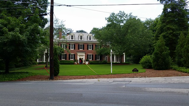
On Saturday I instagrammed (@terrykearns) the picture below from Peachtree Heights. Jason Cook responded. "It's a Neel Reid."
That would explain something: This giant house made me feel great. This is true of all five Neel Reid's I've visited. Have you toured one? The pictures can't capture the feeling.
Why don't we just keep doing them like this?

"Job 503 Robert Alston house 1922-23 HRA. AHS. Grady, pp. 135-41" from J. Neel Reid, Architect: Of Hentz, Reid & Adler and the Georgia School of Classicists by William R. Mitchell Jr.
Though the rooms were cluttered for the estate sale, the spaces seemed perfect to me.
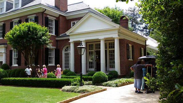
It's huge, see the red sweatshirt guy in the doorway? But my brain isn't thinking BIG. It's thinking "pretty" and "harmony" and it's thinking, "These folks have REALLY arrived."
It takes a lot of detailing to get delightful harmony. These closer you look, the more details you see. The double doors open to the kitchen / keeping room.
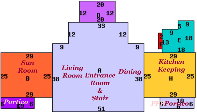
I only saw the public rooms and they were big but no detail called attention to itself. The rooms were compositions in space, proportion and detailing put together for my pleasure.
I didn't notice the details at first, just the feeling.
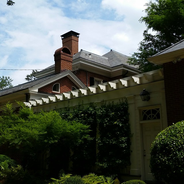
My experience was straightforward but there was nothing simple about it.
But what about these columns?
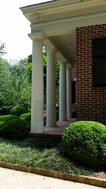
What do you call 2/3 fluted columns?
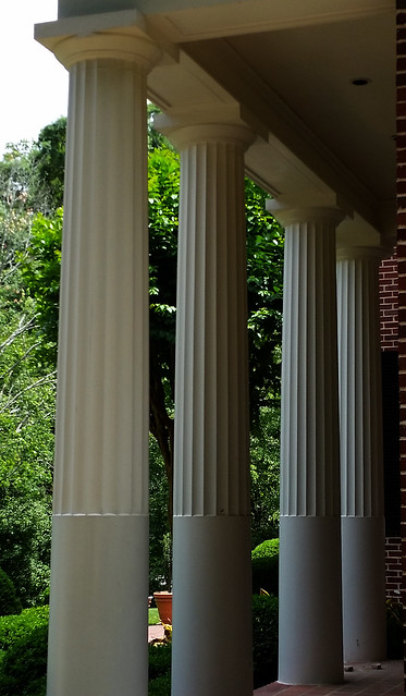
Looks like brick / column meet-up might have had some rot issues over the years.

They're called "stop fluted". Very common feature. Even in Pompeii, and centuries before, all over the place. It keeps the flutes from being banged up by daily traffic.
ReplyDeleteThanks so much, flute bumpers.
Delete