Pages

Friday, August 26, 2016

Candler Park TOD & Gentrification times Four in Four Forms - Let's Watch


Transit Oriented Development (TOD) stirs all the right feelings in the breasts of urbnaists. Gentrification seems the name for evil, on par with McMansion. That's another blogger's blog to blog.

The architecture tourist is particularly interested in the contrast of style and form and will enjoy the construction as a spectator sport. I hope I'll like them, hope they'll feel like home.

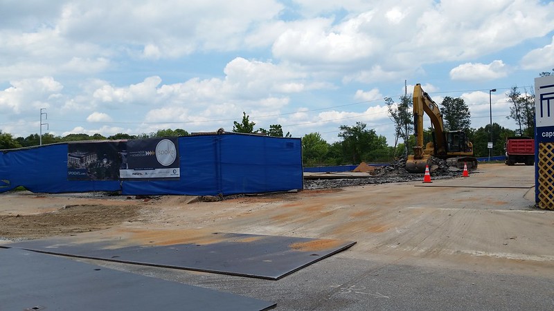
Right now all the hoopla is about Edgewood/Candler Park Station TOD being built in the MARTA parking lot. It's called "Spoke," 224 units with park, restaurant and performing arts center, 20% of the units allocated as affordable housing.

But there are three more projects under way within a couple of blocks all sharing access to MARTA and everything.


 20160823_131551
Spoke is what 4-story mod apartments look like these days, maybe they'll throw in some natural finishes though the current renderings don't show it.
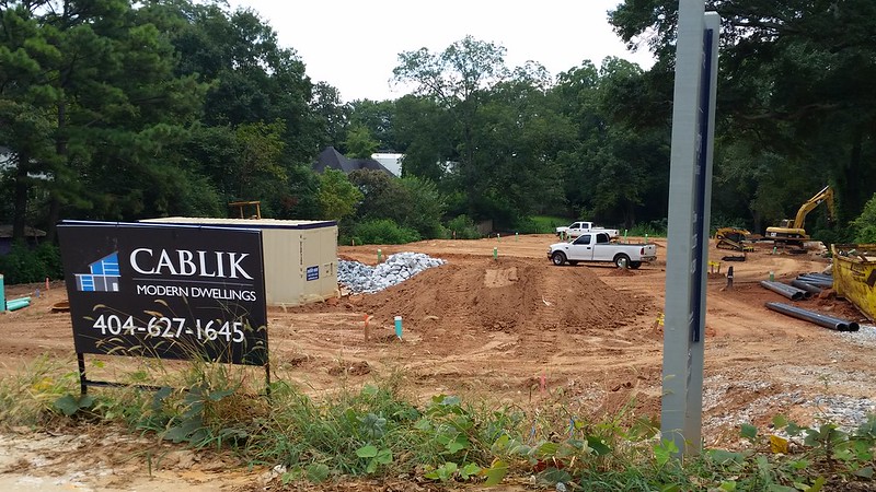
20160823_131741
1463 LaFrance: Modern Dwellings by Cablik looks like 5 townhouse boxes on a shotgun lot. They've got that modern look.
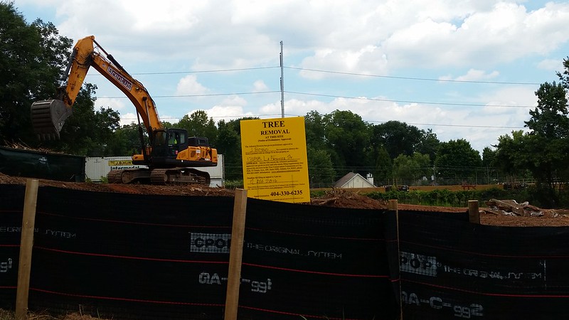

20160823_131830
1388 LaFrance Street by Minerva USA is a traditional styled townhouse development on a corner lot. With Spoke it will form a landmark canyon gateway between the Candler Park and Edgewood neighborhoods. A good thing I think I hope.
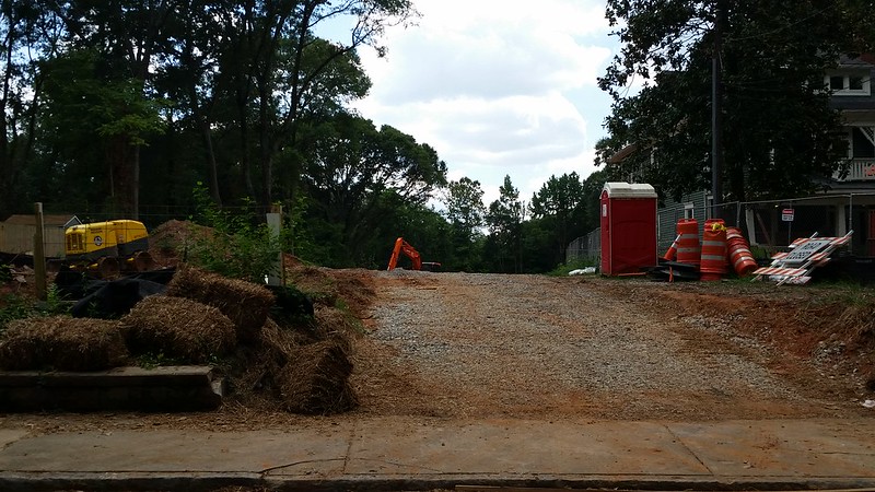

20160823_131855

La France Walk by Eric Kronberg is a Cottage Court on a shotgun lot, standalone houses in vernacular style that echoes the neighboring houses. My pre-race favorite.
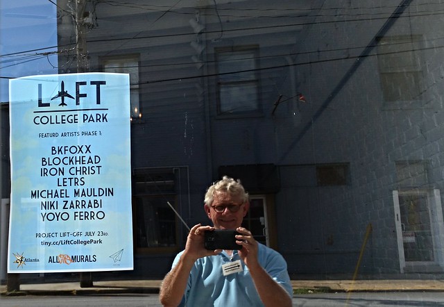
20160724_161321 2016-07-24 yoyoferro liftcollegepark Harvard at Main College Park Georgia Paper Plane Gallery C4 Atlanta Artist Line up TK
Please say hey if you see me out there.

Sunday, August 14, 2016

"...which seem designed not to fit in but to stand out." Three Ideas from Roger Scruton


Roger Scruton believes that the "Vernacular Classical Idiom" is a proven idea for fitting in. Me too. We're about to have this demonstrated on La France Street in Edgewood. We'll talk about it next year.


How's your week?

In Atlanta we're talking about an at-risk Jova designed modernist round bank that amuses thousands of drivers every day. We're buzzing about a no-longer at-risk Breuer designed brutalist library which impresses but inspires little love.

We whine about McMansions every single day, those spreadsheet designed houses that don't fit in, certainly works of the devil. We're building these in every hot neighborhood from Kirkwood to Tuxedo Park.

I don't have words. 

So lucky me. I stumbled in to this 2008 Royal Geographical Society debate,"Prince Charles Was Right: Modern Architecture is Still All Glass Stumps and Carbuncles." Roger Scruton was on the "for" side so you can imagine he's much hated.

I made this transcript of Roger Scruton's introduction which starts about here.

"Regarding the ordinary buildings that have sprung up...which seem designed not to fit in but to stand out."

Principle 1
"We build in order to dwell among neighbors and to dwell is to live among neighbors who have as great in interest in how we build as we do. A town is a home where strangers settle side by side and enjoy a shared sense of belonging. Its streets are public spaces, the facades of its buildings stand in a personal relation to all that pass them by."

Principle 2
"Genius is as rare among architects as it is among the rest of us. Most buildings will be the creation of talent-less people who are simply doing a job like you and me. The less they try to be original and expressive the better. To pretend to these (genius) qualities in their absence is to jettison the three most important social virtues: Modestly, humility, and to act as if others are more important than yourself.

"Most of our beautiful towns were not the work of architects but of modest builders working with materials they understood and on a scale that does not challenge our perceptions."

Principle 3
"Buildings should fit together in a public space that it accessible and friendly to all of us. This is most easly achieved if there is a shared repertoire of details. Materials that blend and do not come apart visually at the joints and proportions that can be emulated by each new addition to the towns-cape."

IMG_5007-2014-05-13-1369-WESSYNGTON-RD-1344-NORTH-HIGHLAND-AVE-at-Wessyngton-teardown-before

Modest, yet...

IMG_5841-2014-05-28-1369 WESSYNGTON RD 1344 NORTH HIGHLAND AVE Teardown demolition

Deep reveals. Too expensive these days for anything but an estate house.

Monday, August 8, 2016

Now You Don't Have To Tear It Down to Save It: McGruder Street Church

I'd been stalking the McGruder Street Church of God in Christ (1940) for about a decade. It's a little landmark. Here's the deal:

"Most landmarks and focal points in cities - of which we need more, not fewer - come from the contrast of use radically different from its surroundings, and therefore inherently special-looking, happily located to make some drama and contrast of the inherent difference ... noble buildings ... set within the matrix of the city, instead being sorted out and withdrawn into 'courts of honor'"- Page 228, ”The Death and Life of Great American Cities” - Jane Jacobs, Vintage Books Edition 1991


Finally in 2011 I spotted someone entering. I slammed on the brakes and ran after them. This "slam on the brakes and run after them" is NOT always the best method for this sort of thing. But it worked this time.

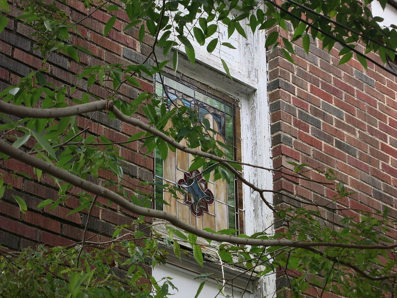
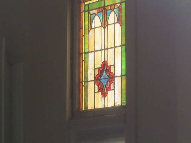
IMG_5189  2013-09-15-McGruder-Street-Church-of-God-in-Christ west facing stained glass from outside
I learned that zoning and building codes prevented the owners from converting it into a place to live.
 
P1020786-2011-12-01-McGruder-Street-Church-of-God-rear-west-detail-wide

Parking was the prime issue. I'm paraphrasing: To make it a place to live they had to add off-street parking. There's just not room. (And that's not all.) So it sat empty and unused.

IMG_5191   2013-09-15-McGruder-Street-Church-of-God-in-Christ west facing stained glass phographed though the glass door

I won't bore you with the details because I don't understand them. Let's just say, what they couldn't do then they can do now.

But that's not what I'm here to blog about.

Last night I ran into Shana Robbins. Her family was connected to this place.

It reminded me that they built a new house across the street that featured views of the church.

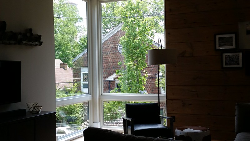
20160612_140434 2016-06-12 McGruder Street Church Modern Atlanta Tour MA

Here's the view from the first floor.

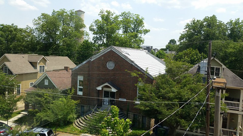
20160611_145035 2016-06-11 McGruder Street Church Modern Atlanta Tour MA

Here's the view from the second floor. Bravo: designing to take advantage of  two Old Fourth Ward landmarks.