I should have taken 500 pictures. I was short of time on my first visit, my battery died on the second. I thought I'd never see it again and I was right - but for a different reason.
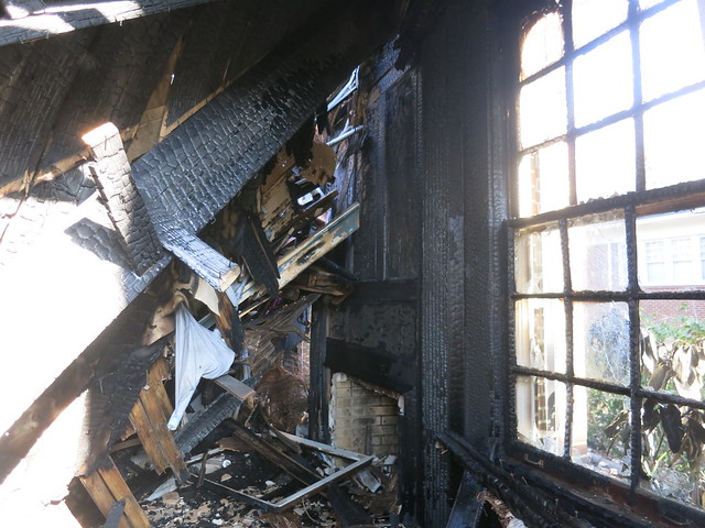
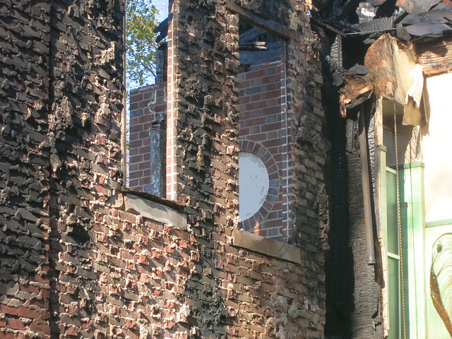
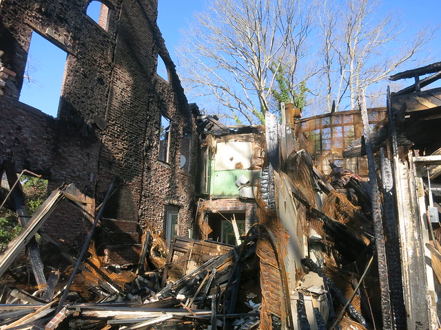
Last Tuesday it burned. I blogged it in 2012 "Unstaged, academic, and emotional: the Aronstam House by Pringle and Smith 1928 ." I'm replaying that post today with fire pictures and my new comments italicized.
As I entered, I lost my focus and objectivity. I needed a plan, days of preparation, and a camera bigger than my head to take it in. So I just let go and wandered around. This is the most fun an architecture tourist can have on a weekday.
Last Tuesday I spotted balloons on Ponce de Leon and turned down Lullwater. There it was, a hilltop Druid Hills mansion, almost 6000 square feet on a couple of acres, open for a few hours. You just don't get to do this unless you are in the business.
Sunday morning after the Tuesday night fire.
It's by Pringle and Smith. I wondered if it was in Robert Craig's new book, "The Architecture of Francis Palmer Smith, Atlanta's Scholar Architect" Yes it is, on pages 82-83, but that doesn't settle everything. The tax records say 1924, the book says 1928.
It's way up there and a bit overgrown.
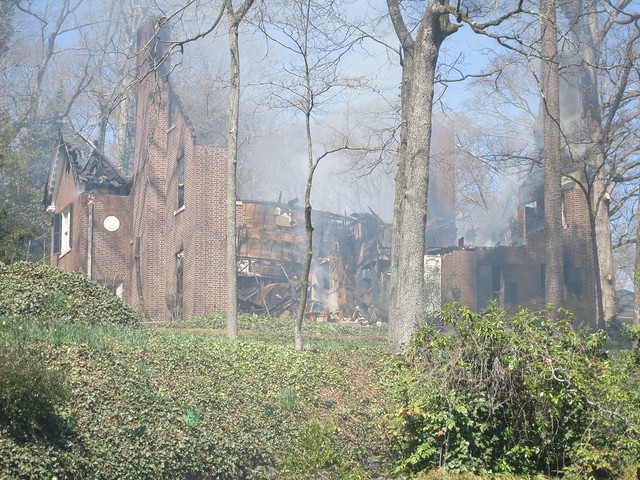
It was still smouldering on Wednesday morning, white haze with campfire smell.
Robert Craig:
"For suburban dwellers in Druid Hills and Peachtree Heigths Park, a Georgian Revival residence brought adequate sophistication and elegance without the domineering scale or show of a palatial country house."
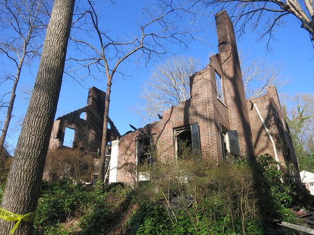
On Sunday you couldn't tell when the fire was.
Robert Craig:
"...main focus is the elaborate entry-door frame. Here a broken swan's-neck pediment with an urn finial recalls... (the) south door of Westover..."
This is a big house but it doesn't seem THAT big. It's just 5 bays.
It doesn't seem that big from the front but it's like there's a back house behind the front house.
It was a slog up the driveway to the front door, not girl scout cookie friendly. I doubt many folks used the front door.
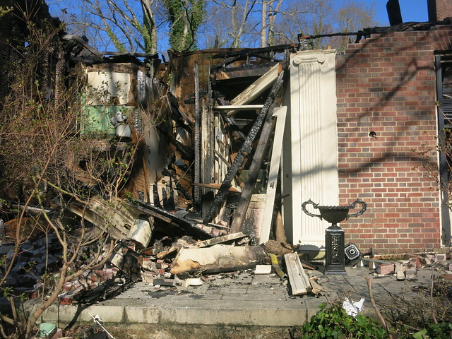
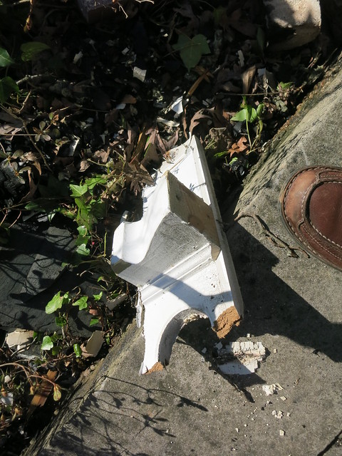
One pilaster and the front door were still there, the "broken swan's-neck pediment with an urn finial" wasn't.
As I approached, the house began revealing it age.
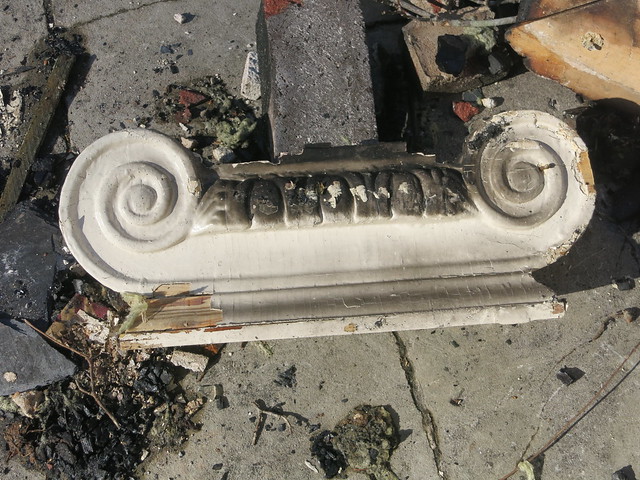
Here's the left capital.
Walk inside with me: The wall-papered foyer, the grand arch to the stair hall, to the dining room. On the right the library, to the left the living room and doorways to the to the enclosed porch and dining room.
Robert Craig:
"...the formality of the facade has given way to the lifestyle of the modern suburbanite, and Pringle and Smith planning reflects the freer movement from room to room of occupants not governed by the authority of absolute classicism."
The library.
I had just a few minutes.
Mrs. Robinson said only two families lived there, one raised 5 children there but no one had lived there in more than a decade.
It was the real thing. I was looking from the stair hall through the great arch across the foyer into the living room.
I felt like I should be there.
It had been cleaned out a bit but it hadn't been staged. It was in "lived-in" condition rather than move-in condition. The basement looked and smelled all of its nearly 90 years, a realistic smell, not a bad small.
I'd never seen Greek key in crown molding before.
Bulges, fluting, spider webs, and acanthus leaves are refined and quiet.
The green tile in the now "hanging bath" caught my eye.
The lower arch leads to the side door. Surely this area was a busy place for a family of 7. In Shutze's Knollwood, an elaborate stair is front and center, not here.
Robert Craig:
"The 'front and center' entry of the Aronstam residence leads to a center hall, but ells to the right, halfway back, to reveal the main stair hall set off to one side."
I loved the stairs, sturdy and wide, lit from the north. I imagined kids banging their way up and down day and night.
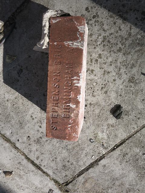
Here's a 1908 picture of Stephenson Shale Brick Co.'s Plant, Lovick, Jefferson County, Ala..
The bedrooms are upstairs. They open to this big hall. What do "modern" folks do with a room like this?
This is a Jack and Jill bath. The bathrooms aren't my style but I fell in love. They are all like this. I weep to think of them redecorated, gutted.
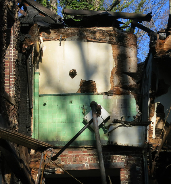
All the bathrooms were in this style.
I was lost in thought when I realized I was alone, they were closing up.
I'd not seen anything and I'd wouldn't get another chance.
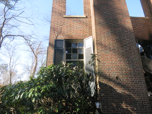
Some shutters escaped the flames.
Louis Aronstam was president on Southern GF Steel which remains a going concern after 100 years.
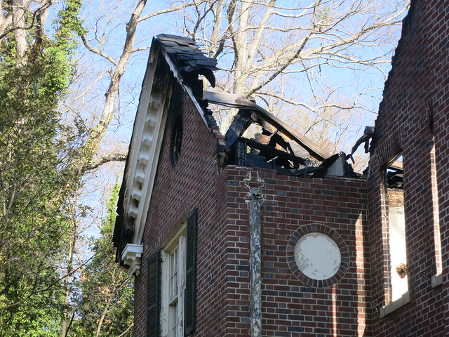
This was not fun. But I don't think this house is done.
Pages
▼
Monday, March 31, 2014
Sunday, March 23, 2014
Maybe Make Manuel's More Transparent? City-Lovers Don't Go Out to Cocoon
I had a Blinding Flash of the Obvious (BFO) at Kate Sweeny's giant book-signing party. Manual's turns its back on the street, gives us a cold shoulder. (See the footnotes for academic citations.)
I understand: I never wanted my mom (or my boss) to catch me in a bar or worse: catch me underage in a bar smoking cigarettes. But that's not how we design these days and city-lovers don't go out to cocoon.
So this was outside. It was really rocking.
Inside.
How many times have you been at North Avenue and North Highland, the Manuels corner? That would be thousands of times for me. It is the only place on North Avenue that is interesting and comfortable for pedestrians, the only place on North for worthwhile people watching.
See what catches your eye next time you are cruising North at North Highland. The King of Pops in Buddy's parking lot contributes infinitely more life than our favorite bar.
Outside.
Inside.
Outside.
Inside.
Outside.
Inside the Wasted Potential Brass Band was playing.
Wasted potential is right.
FOOTNOTES:
My BFO came at GreenPrints, where urbanism's lovability quantitative academic Reid Ewing claimed that "transparency" is good stuff. I believe!
Of course: Transparency. My brain translated it as "eyes on the street" plus "people-watching."
It's got coefficients, t's, and p's. See Reid Ewing, Ph.D. – Metrics of Urbanism.
As usual A Pattern Language: Towns, Buildings, Construction explains it in human terms.
164. STREET WINDOWS
. . . any streets with people in them, these streets will only come to life if they are helped to do so by the people looking out on them, hanging out of windows, laughing, shouting, whistling . . . A Street Without Windows Is Blind And Frightening. And It Is Equally Uncomfortable To Be In A House Which Bounds A Public Street With No Window At All On The Street . . .
165. OPENING TO THE STREET
. . . many places in a town depend for their success on complete exposure to the people passing by - far more exposure than a STREET WINDOW . . . This pattern defines the form of the exposure. . . . The Sight Of Action Is An Incentive For Action. When People Can See Into Spaces From The Street Their World Is Enlarged And Made Richer, There Is More Understanding; And There Is The Possibility For Communication, Learning . . .
192. WINDOWS OVERLOOKING LIFE
Rooms Without A View Are Prisons For The People Who Have To Stay In Them . . .
P.S.
Congratulations Kate.
Sunday, March 16, 2014
The Hilan Theater Is In There, Did You Know?
This great Atlanta neighborhood just can't support this space - but I hope I'm wrong. Maybe you have an idea?
It had been wide open day and night so I finally walked in on February 27, asked if I could take some pictures. I love theaters and then there's the roof. This may be the only way you'll ever see inside.
Folks are renovating the storefronts between Atkins Park Restaurant and Surin of Thailand where Ben and Jerry's, Starbucks, and Key Lime Pie were. Curbed wrote about it: Empty Va-Hi Spaces May Fill Soon. But About That Theater…
"A December 4, 1937, Boxoffice magazine obituary of Atlanta showman Louis Bach says that he built the Hilan Theatre in 1933
"A few years after the theatre closed in 1969, it became the home of the Metropolitan Community Church." Currently ... ice cream parlor (Ben and Jerry's) and coffee shop (Starbucks) reside(d) in the space once occupied by the Hilan’s entrance and lobby." - First Metropolitan Community Church
Did you know it was theater?
From the Dark Horse in the back of Surin you can see the big boxy thing where the auditorium is.
From North Highland there's a long corridor back to the theater.
I think they renovated the auditorium hoping to attract the Cotton Club. What with parking, noise, and late night rock and rollers the neighborhood didn't go for it. The Cotton Club moved to the basement of the Tabernacle.
All dressed up and no place to go: Terrific renovation. They removed the sloped floor, there's a dance floor, a mezzanine, and a balcony, two bars.
From the behind the balcony bar.
They kept the good parts.
The proscenium style stage has it own behind-the-band balcony.
I took this from the southern Juliet balcony.
Maybe these will help give you a sense of the space.
Panoramic video from the center stage 30 seconds.
Panoramic video from the southern Juliet balcony 24 seconds.
Then there's the roof!
There are two levels of rooftops up there.
The first level.
Looking down on North Highland. I want to party here.
There's another level.
Yeah...
I want to party here too.
To the north "Wolfmother" Mural by Matt Haffner commissioned by whitespace.
To the east the steeple of Druid Hills Methodist designed by Ivey and Crook
To the south the lantern at Druild Hills Baptist designed by Edward Bennett Dougherty
To the southwest Druid Hills Presbyterian designed by Francis Palmer Smith.
Now you know.